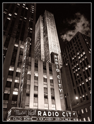
This is a shot of Radio City Music Hall in New York City. The tall building In the background is 30 Rockefeller Center. I was in New York on business and decided to walk to Rockefeller Center to take some shots. I didn't have a tripod with me, so some of the night shots didn't work out. This one, however, was one of my favorites.
I took this shot from across the street. I found a place where I could sit to get better stability. The shot was taken at a 35mm effective focal length of 28mm for 1/5 of a second. The image stabilization feature of my Olympus E-3 did a nice job keeping the image sharp.
When I took the shot I was thinking about the color of the signage. When I processed the shot, however, I wondered if a black & white image might not be more fitting.
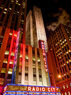
Here you see the unprocessed, color version. I like the various colors caused by the lights used to illuminate the buildings. Radio City Music Hall is obviously more red because of the signage. In the background, 30 Rockefeller Center is more white because they use a strong white light to light up the building. The color image is nice, and I may do more with it later, but I really think the subject matter works better in black & white.
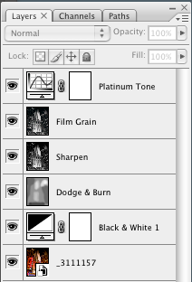
The conversion to black & white was fairly straight forward. I didn't spend a large amount of time on tweaking parts of the image. As you can see from the layers palette the basic steps were:
- Add a black & white adjustment layer
- Do some dodging and burning
- Sharpen the image
- Add some film grain
- Add a platinum tone
When I did the conversion to black & white, I was looking to create some additional contrast. I wanted the light buildings to be lighter, and I wanted to the dark buildings to be a little darker. I also wanted to make sure that the steam was visible. The black & white conversion layer primarly has adjustments to the red and yellow components. The red is -16% and the yellow was set to 107%. I did this mostly by clicking on the image and dragging in the areas that I wanted to make lighter or darker.
To do the dodging and burning, I added a new layer set to Overlay mode and filled with 50% gray. I used a relatively soft brush, set to a low opacity, and simply painted over the areas that I wanted brighter or darker. To make the area brighter, I chose white as my brush color, to make it darker, I chose black. By using a low opacity, I was able to better control the effect. I could paint over an area, and if it wasn't bright enough, I could paint again.
After getting the image about where I wanted it, I decided to sharpen. I knew I was going to add some film grain and I didn't want the sharpen the grain itself (although that may have looked nice as well). I used the Unsharp Mask filter and used a moderate level of sharpening.
One problem I have with digital black & white images is that they can be too 'clean'. With b&w film, you could use the grain characteristics to enhance the image. I decided that for a more 'vintage' look I would add some film grain. I used a technique described by Katrin Eismann in one of her videos available at www.kelbytraining.com. Her technique is to add some noise to each of the channels, along with a slight blur.
I started by viewing the channels and selecting the blue channel. I then selected Filter->Noise->Add Noise and used a value of 8% gaussian. After that, I applied a gaussian blur of 0.3 pixels. I repeated this process for the green channel, reducing the noise to 6% (but using the same amount of blur) and finally for the red channel where I used 4%. After making these changes on their own layer, I set the layer mode to luminosity to get rid of the color artifacts. I think this process works quite well.
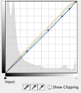
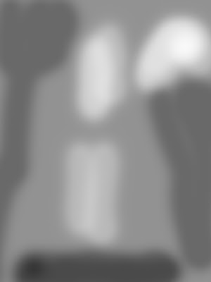
The final step was to add a bit of toning to the image. The pure black & white looked nice, but I really like the look of platinum prints and I thought that would work well with this image. I had found some pre-built curves on the web, one of which reproduces the look of a platinum print. You can see by looking at the curve that a bit of green and red was added and blue was taken away. The final steps were to add a simple black border around the image and the final result is what you see at the top


No comments:
Post a Comment